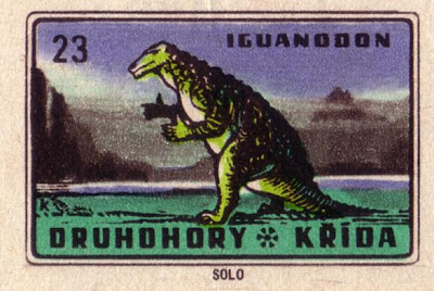
Thought these would make a good post after going through Oliver Tomas's amazing archive of classic graphics. Really liking the heavy shadings and consistent colorways throughout the set. It just seems like a super cool idea for matchbox labels, and even though I'm not a smoker, if these were sitting out on the table for free at a diner I would grab some and start smoking like its 322 million years ago.
Follow him @olivertomas
Also be sure to check out one of my all time most favorite image sets ever, 1960s & 1970s Scandinavian design logos from him here.


Tidak ada komentar:
Posting Komentar