Tampilkan postingan dengan label texture. Tampilkan semua postingan

Kamis, 17 Februari 2011

Course but Polished Posters By Jason Permenter


I can't get over how visually attractive Jason Permenter's Tenderloin Coffee Crawl poster is.  It has just the right balance of subtle type work, bold graphics, and texture effects to create a nicely polished look that doesn't look too clean while at the same time not overdoing it.  My eyes start from the top, go to the middle, and get drawn even more to the text box at the bottom that has some really great text placement  Oh yeah, Jason use to be a Volcanologist.

Follow him @Jasonpermenter

Selasa, 18 Januari 2011

So Textured by Studio Ace of Spade


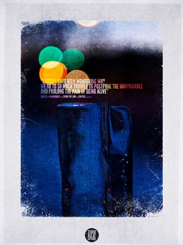
Studio Ace of Spade is the graphic firepower of Simon Hartmann and Jon Savage based in Goshen, Indiana. Gathered a solid selection of work from them to display their love for textures and typography.  It looks like they like circles. So do I.

Is that not the most amazing 2 ever in the first poster, I can't get over how well its made to make the number the center of visual attention.  The number is from a set called Pompadour from Andy Mangold.

Follow them @simonhartmann & @jonathanTsavage

Another bonus, Simon is such a swell guy that he put up some really nice textures on his flickr which you can check out here.

Senin, 20 Desember 2010

Dandy Posters by Brian Cook

Featuring Brian Cook from Manchester, Connecticut,  here are some posters I came across that I liked for the usage of type and textures.  Visually playful and nicely done with the graphics, these are just great.  The last piece is absolutely Schrute-worthy.