Tampilkan postingan dengan label film poster. Tampilkan semua postingan

Rabu, 26 Januari 2011

Cinema Posters and Lobby Cards of Andrei Tarkovsky's Films


So I watched this Royksopp music video that a friend sent to me, which had a comment by some random guy referencing this Russian film from 1979 called "Stalker" which in turn led me to discover the director Andrei Tarkovsky, and his notable films -- as well as the amazing posters and designs that were made for them, including Solaris and The Sacrifice.  Images come from this fabulous non-profit tribute site to Tarkovsky, nostalghia.com, which is worth visiting if you love the director or his films.  Design credits are unknown for a lot of these, but some are really fantastic.  The Solaris poster at the top is the Flyer Goodness favorite.

Kamis, 12 Agustus 2010

27 Years of Classic Movie Posters by Saul Bass (1954-1981)

"Vertigo" Movie Poster designed by Saul Bass.

Opening credits for "Vertigo" Movie animated by Saul Bass.


Saul Bass' poster for The Cardinal
image via impawards.com


Opening Credits for "Anatomy of a Murder"


"West Side Story" movie poster by Saul Bass.
image via impawards


image via The Guardian


A snapshot of the title screen for "North by Northwest"
image via danielsamson


image via impawards


Opening credits for "Its a Mad, Mad World" animated by Saul Bass


image via hollywoodland


"In Harm's Way" movie poster by Saul Bass.
image via Wikipedia


image via meansheets


image via bigoldtoe


image via the looniverse


image via Wikipedia


Poster for "The Man with the Golden Arm"


Opening credits for "The Man with the Golden Arm"


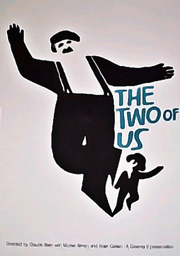
"The Two of Us" poster by Saul Bass.
image via the looniverse


Former Jetblue employee and free-spirit extraordinaire Steven Slater use to be my hero as of last Monday,  but now I have a new one. Considered as one of the most innovative and groundbreaking graphic designers of the 20th Century having worked with topnotch filmmakers like Hitchcock and Scorsese, the legendary Saul Bass has certainly made a mark in the design world with his pieces.  He's done some really wonderful work ranging from film posters, logos, and credit sequences--most of which has been recognizable over the years and still influences design today.

I've always secretly loved the logos for Bell, AT&T, and United Airlines--


Check out more of his his posters, logos, & opening credit sequences over at Wellmedicated and Signalnoise.

Kamis, 24 Juni 2010

The American - New Flim Poster


An excellent movie poster for the upcoming George Clooney flick, "The American."  It definitely takes a lot of clean design cues from several decades ago.  Anyone have any ideas about specific artists who've done stuff in this style?

via Aint It Cool News

Selasa, 22 Juni 2010

Mad Men Season 4 Premiere Poster + The Graphic Art of Mad Men


Here's the poster that was released to promote the new season of Mad Men on July 25 on AMC.
via Entertainment Weekly


The Season Three poster is a bit more dramatic and intense, although the water flooding the office is very metaphorical and unexpected, I don't know how I feel about how well its aesthetic reflects the clean, clear and straightforward style of the show.

But nonetheless, Mad Men Season Three's poster is well done.  You can watch this "Making of" video on the Season 3 poster below to see the whole process of how it was produced:


For additional reference, here is the Season 2 Premiere poster for Mad Men.


The DVD cover art is really clean too.  Season 3 and Season 2 are really well executed:


Now for some fan art:

Check out these Mad Men posters by Christina Perry.  Available as a Giclee print, more details at her website here.


Apparently each of the main characters in Mad Men have not only a unique suit, but also unique pocket squares.  I was never aware of that when watching the show, but Christina Perry definitely has a great eye for detail.  Roger Sterling's pocket square definitely suits his vibrant energy, while Don Draper's pocket square is definitely much more subtle, simple and clean-cut.


There's a lot of Mad Men fan art out there, but I really like this one by Stanley Chow.  He does a bunch of great illustrations in general, you can check them out on his website here.


And because Flyer Goodness is a flyer and poster art blog, don't think we copped out completely with this post.  I wouldn't consider this RJD2 gig poster by Mark Malazarte a parody, but it definitely tilts its hat at the Mad Men opening title sequence.  See the original post here.